
Choose the Version That Fits Your Existing Room
Coastal is a broad decorating direction, not one mandatory palette. A quiet, beach-inspired room and a more formal navy-and-white room can both reference the coast. You do not need to replace working furniture to make either one convincing.
- Light and textured: keep the large surfaces pale, then add woven texture, soft green or washed blue. This is a useful starting point if you already have light upholstery.
- Graphic and nautical: use navy, crisp white and stripes deliberately. Repeat one motif rather than adding every maritime reference you find.
- Warm and collected: retain an older wood table or dark dresser. Balance it with lighter textiles, open space around it and a framed place that means something to you.
Photograph the room in daylight and after dark. List the floor, sofa, cabinets and other finishes you are keeping. Those undertones are a better starting point for paint samples than a beach photograph viewed on a phone.
Build a Palette Without a Fixed Percentage Rule
Choose a background, a supporting color and a small contrast. For example: off-white walls, faded blue textiles and dark wood frames. Another option is pale green, natural oak and white cotton. These are sample combinations, not requirements.
Test paint beside the floor and upholstery you own. White can look warm, cool or almost gray depending on the light and nearby finishes. There is no reason to reject your existing white walls simply because a style guide calls them too clinical.
If you already have a navy sofa, let it be the darker anchor. You might use a lighter rug and plain curtains instead of buying more navy pieces. With honey-colored wood, try a muted blue or green sample before deciding the furniture belongs to the wrong style.
- White and blue
- Compare a blue textile beside the white already in the room. Navy, a pale shade or a larger blue surface are alternatives, not an accent-only rule.
- Green and existing wood
- Try a green sample beside a dark or pale wood finish. Keep the furniture you use rather than specifying the lightest timber available.
- Clay and cream
- Compare a clay-colored ceramic or textile with cream and the retained metal. The combination is an option, not proof of a Mediterranean location.
- Graphic contrast
- Try a dark frame, stripe or navy detail with a plain background. A personal nautical collection can stay if the full arrangement and usable space work for you.
If clay, stone or patterned tile is the reference you want, compare the Mediterranean materials and room plans. It separates particular architectural examples from a single coastal palette, with living-room and bedroom projects around furniture you keep.
Compare the Look With the Care It Needs
Linen, cotton and slipcovers
Use texture on curtains, bedding or a sofa cover. Check the actual care label, shrinkage instructions and whether covers are removable. Natural fiber does not automatically mean machine-washable or stain-resistant.
Woven rugs and baskets
A woven rug can add texture without another strong pattern. Check comfort underfoot, chair movement, cleaning instructions and the intended room. Jute or seagrass is not automatically suitable for damp areas.
Wood, rattan and cane
Use one or two visible textures rather than matching every piece. Check the finish and intended indoor/outdoor use. A coastal appearance is not evidence that furniture tolerates sun, salt air or bathroom humidity.
Ceramic, glass and metal
A simple vase, lamp or existing metal hardware can provide contrast. Chrome is not forbidden, and replacing all the fittings is not a necessary first step.
Keep privacy and sleep in the plan. Sheer curtains can soften daylight, but bedrooms may still need a blackout layer. Choose task lighting for reading or cooking as well as softer lamps for the evening.
The Canadian Conservation Institute's basketry guide distinguishes cane and wicker terminology and describes water-related damage to plant materials. This is heritage-collection guidance, not a household cleaning recipe or a weather rating for a modern chair. Ask for the actual product's construction and intended use instead of treating a beach-house look as a specification.
Six Coastal Living Room Projects
1. Keep the sofa and try a coastal textile
A blue stripe, plain cream cover or textured cushion can introduce the reference beside a navy, dark or light sofa. Try the seat occupied before changing depth or buying a new frame. Read the actual fabric and cover-care information; a linen look and a performance-fabric label are not specifications for every product.
2. Compare paint, curtains and privacy as one view
Put a paint sample beside the retained floor and sofa, then operate the window covering. Warm white, cool white, blue and a darker wall are options. Keep the view when useful, but include glare, privacy and access; a ceiling-height sheer is not compulsory and does not replace every light-control layer.
3. Try one floor texture before layering rugs
Compare the full rug outline, occupied seating and the route across its edges. Jute, sisal, cotton, wool and a suitable synthetic each need their own care check. Two rugs and all furniture legs on the base rug are not required. Include cleaning and movement rather than assuming a natural weave tolerates sand or damp.
4. Compare a woven chair with the wood and metal you keep
A woven seat or pale wood detail can contrast with a dark table, chrome fitting or existing manufactured piece. Try support, seat comfort, load and the actual finish. Rattan, cane and a driftwood-effect label do not certify handcraft, weather resistance or suitable structural wood.
5. Give the light and optional plant separate jobs
Try reading light, switch reach, glare and clearance before choosing a woven shade. A pendant is one option, not a reason to remove useful spotlights or lamps. For any plant, match its actual requirements to the location and allow for watering and growth; one large tropical plant is not the missing ingredient in every coastal room.
6. Leave usable table space beside a personal wall
Arrange books, a tray, a ceramic or a shell collection around drinks and equipment you actually use. There is no one-tray/one-stack/one-plant formula. A photograph, chart or map can refer to a meaningful place; compare the complete framed layout, support and fixing rather than assuming a large map is always the most personal choice.
For occupied seating and wall dimensions, compare Scandinavian living-room projects and living-room art planning. They are different briefs, not a scale of refinement or comfort.
Six Coastal Bedroom Projects
1. Keep a suitable bed before choosing pale wood or rattan
Check the actual mattress support, getting in and out and the occupied route. A pale, dark, upholstered or existing bed can remain. A low profile or woven appearance does not establish comfort, construction or suitability; do not use a found piece of driftwood as an assumed shelf bracket.
2. Compare bedding by touch and care, not a linen-only rule
Try a blue-and-white stripe, a plain duvet or one textured cover with the bedding you already use. Check actual fiber, construction and care details. Cotton, a blend or suitable synthetic is not automatically less comfortable, and extra coastal layers are not a sleep treatment.
3. Plan daylight and night-time light control separately
Compare a sheer, lined curtain or blind at the actual window and from the bed. A view and a bright daytime palette do not require unwanted light at night. Keep the privacy and controls you need; a glossy or dark finish need not be removed to make the room valid.
4. Try the floor and bedside routine together
Mark a rug edge and bedside surface with the bed occupied. Include getting up, a drink, necessary equipment, switch reach and cords. A lamp and book need not be the only objects allowed. Check stability, cleaning and useful storage rather than replacing a working cabinet with a small decorative table.
5. Assess the light and wall fixing before the material
A fixed lamp, wall light or properly specified pendant can provide different control and space options. Do not choose a pendant for the effect of swinging in an open-window breeze. Check support, electrical compatibility and clearance. Choose art location and full frame weight separately; a city map is not automatically suitable above the bed.
6. Choose woven details, a collection or a plant selectively
A basket, mirror, hat or seaside photograph can make the reference without buying them all. Keep shells, anchors or a beach sign if you enjoy them. Assess weight, fixing, contents and care for each piece, and actual plant needs if adding greenery. The image is a personal decorating choice, not a guarantee of rest.
For another plan, compare Scandinavian bedroom choices and bedroom wall-art placement. These projects do not test a color, fabric or decorating style as a way to improve sleep.
Use a Real Place as the Wall-Art Brief
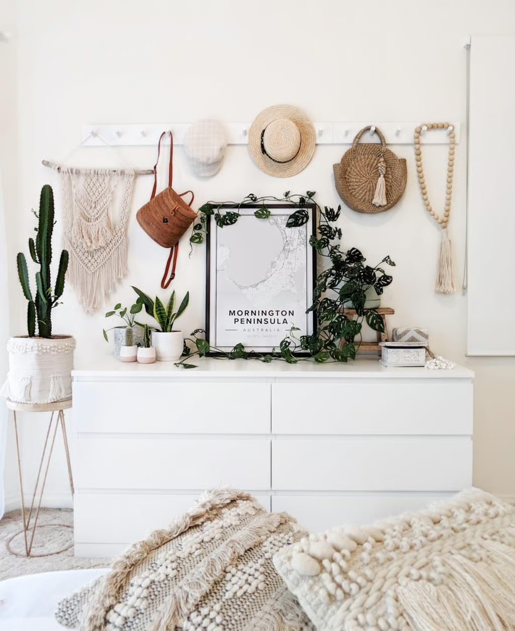
A map of a meaningful bay, a photograph you took by the sea or an artwork from a local maker gives you a specific starting point. A nautical chart or shell print is also a valid choice if you actually like it.
In the example, the black map frame gives the pale arrangement a clear outline. The print has space around it even though the accessories are varied. That balance is worth considering; copying every object is not necessary.
For a custom map, check the editor preview at the intended crop. Confirm that the coastline and place name you want are visible, then check print size, frame inclusion, shipping and the final price. See our Mapiful buyer page for the brand and current-offer checks, not a promise that every location has the same detail.
Above a sofa, measure the whole framed arrangement rather than the print alone. The sofa artwork measuring guide has worked examples.
Give Each Room a Different Job
Living room: keep the seating useful
Start with the sofa, walkway and daylight. Add one textured rug or throw before buying a new furniture set. Use the six living-room projects above for more room-specific options.
Bedroom: prioritize sleep and storage
Keep bedside surfaces usable and choose bedding by feel and care requirements. Coastal styling does not require bright light at night or woven accessories on every surface. Continue with the six bedroom projects above.
Kitchen: work with the cabinets
Try towels, a washable runner or a small framed print away from heat and splashes before replacing countertops. Keep preparation space clear. The coastal kitchen guide focuses on that room.
Bathroom: select for moisture first
A beach-inspired appearance does not make a basket, frame or wood finish water-resistant. Choose products for their actual position and exposure; see the bathroom planning guide before adding decorative materials near water.
A Four-Step Color and Texture Trial
For a hypothetical room with a useful dark sofa or dresser, compare a blue stripe with a plain cream textile instead of planning a full pale-wood replacement. This is an exercise, not a makeover we carried out.
- Record the sofa, floor, wood and metal finishes you will keep.
- Compare the two actual textile samples beside those surfaces, in daylight and with normal lamps.
- Try the sample where you will use it and check care, window operation, bedside reach or occupied seating as relevant.
- Keep, return or revise the sample before extending the color or weave elsewhere.
USFA electrical guidance covers combustible materials near lamps, bulb ratings and cords. A woven shade does not specify a suitable bulb or clearance. For a plant, the RHS guide recommends checking actual requirements against the conditions you can provide. Neither source certifies the photographed arrangement.
A Sensible Order for the First Changes
- Choose what stays, then test colors beside it.
- Resolve privacy, lighting and daily use before accessories.
- Add one textile or material change and live with it.
- Choose wall art for its subject and measured size.
- Price the complete change, including covers, frames, fixings and delivery.
If the seaside reference no longer matters to your choices, organic modern or Scandinavian design may be a more useful brief. The label should help you decide, not force another purchase.